White-label branding
One codebase, any number of branded apps. A brand directory — a service descriptor plus a handful of images — turns into a release APK with its own:
- Android applicationId:
com.aliranclient.<id>. Branded apps co-install side by side, and beside the vanilla dev build. - launcher icon + app name
- splash logo, baked into the APK — it shows before any network I/O
- menu-hub wallpaper fallback and Android TV banner
- full color theme — every token the UI uses; see the descriptor reference
Screens contain no hardcoded brand. Everything flows from the bundled
service descriptor through makeTheme(). Packaging a brand never edits
source. The builder swaps the bundled descriptor for one build, then
restores it afterward.
The repo ships one fictional example brand, client/brands/sunburst/. Real
operator brands are private directories outside the repo with the same layout.
Quick start
# 1) copy the example brand somewhere private and make it yours
cp -r client/brands/sunburst ../acme && $EDITOR ../acme/service.json

# 2) build a branded release APK (same toolchain as a normal client build)
node tools/brand.mjs ../acme            # or: npm run brand -- ../acme

# 3) install it (or pass --install)
adb install -r client/android/app/build/outputs/apk/acme/release/app-acme-release.apk
Prerequisites are exactly those of a normal Android release build: JDK 17 and the Android SDK. See Client build.
The brand directory
<brand dir>/                 dir name = brand id: 1-24 lowercase letters/digits
                             (it becomes the applicationId suffix; --id overrides)
  service.json    required   the service descriptor baked into the APK — same
                             schema as client/config/service.example.json
  icon.png        required   launcher-icon FOREGROUND: square PNG, transparent
                             background, glyph within the middle ~60% (adaptive-
                             icon safe zone). The background layer is a flat fill
                             of branding.colors.primary.
  logo.png        optional   splash wordmark (transparent background; rendered on
                             branding.colors.brandSurface). Without it the splash
                             shows the service name as text.
  wallpaper.png   optional   menu-hub wallpaper when no featured stream provides
                             a backdrop (panel curation still wins when it does)
  banner.png      optional   Android TV launcher banner, 320x180
  res/            optional   escape hatch: a full Android res tree copied verbatim
                             over the generated overlay (e.g. hand-tuned
                             per-density mipmaps replacing the adaptive icon)
brand.mjs wires the images up automatically. When logo.png /
wallpaper.png exist, and the descriptor doesn't already set
branding.logo / branding.wallpaper, the builder uses the baked
drawables. Those fields also accept https:// URLs, but only baked art
shows before the network is up.
Building
node tools/brand.mjs <brand> [options]

  <brand>      brand id under client/brands/<id>, or a path to a brand dir
  --dev        borrow panelPubKey / bootstrap / hybrid / dev login from the local
               gitignored client/config/service.json (demo + local testing only)
  --id <id>    override the brand id (default: the dir's basename)
  --variant    release (default) or debug
  --install    adb install -r the APK after a successful build
  --no-build   validate + generate the res overlay, then stop
What a build does:
- Validates the brand dir: descriptor sanity, required art, and a hard
refusal of any
devcredentials block — brand dirs must stay shippable. - Generates an Android res overlay under
client/android/app/build/aliranBrand/<id>/res: app name, adaptive launcher icon (youricon.pnginset 18% over abranding.colors.primarybackground), and the splash logo / wallpaper / TV-banner drawables. - Swaps
client/config/service.jsonfor the brand descriptor. Your dev config is backed up and always restored, even when the build fails. This step also forces a fresh JS bundle, because the React Native bundle task doesn't track the descriptor as an input. - Runs the property-gated gradle flavor
(
-PaliranBrandId=<id> -PaliranBrandRes=<overlay>→:app:assemble<Id>Release). Without those properties,build.gradledeclares no flavors at all, so plain dev/release builds are unaffected.
The APK lands in
client/android/app/build/outputs/apk/<id>/<variant>/app-<id>-<variant>.apk.
Desktop player (Windows)
The same descriptor brands the desktop player. Its
screens also render entirely from branding: colors become the UI's CSS
variables, and the splash logo, menu wallpaper, and service name come from
the same fields. So a brand's service.json carries over unchanged:
- Copy the brand's
service.jsontodesktop/config/service.json. - Package:
cd desktop && npm run dist. The descriptor is baked as a resource, and the build boots with your panel key and theme (see Desktop player §4).
Two desktop-specific notes:
- No
brand.mjsequivalent yet. You set the installer/exe icon and product name by hand indesktop/electron-builder.yml— they stay "Aliran" otherwise. Everything inside the app is branded with no edits. - The PNG files in a brand dir are Android packaging inputs. For the
desktop, point
branding.logo/branding.wallpaperat https URLs in the descriptor. Baked Android drawable references don't exist there.
Reseller panel dashboard
The reseller panel's web dashboard white-labels at runtime, entirely from environment variables. There is no build step and no source edits, and changes apply on the next page load. This is the surface your third-party resellers see, so it is usually the first thing you rebrand.
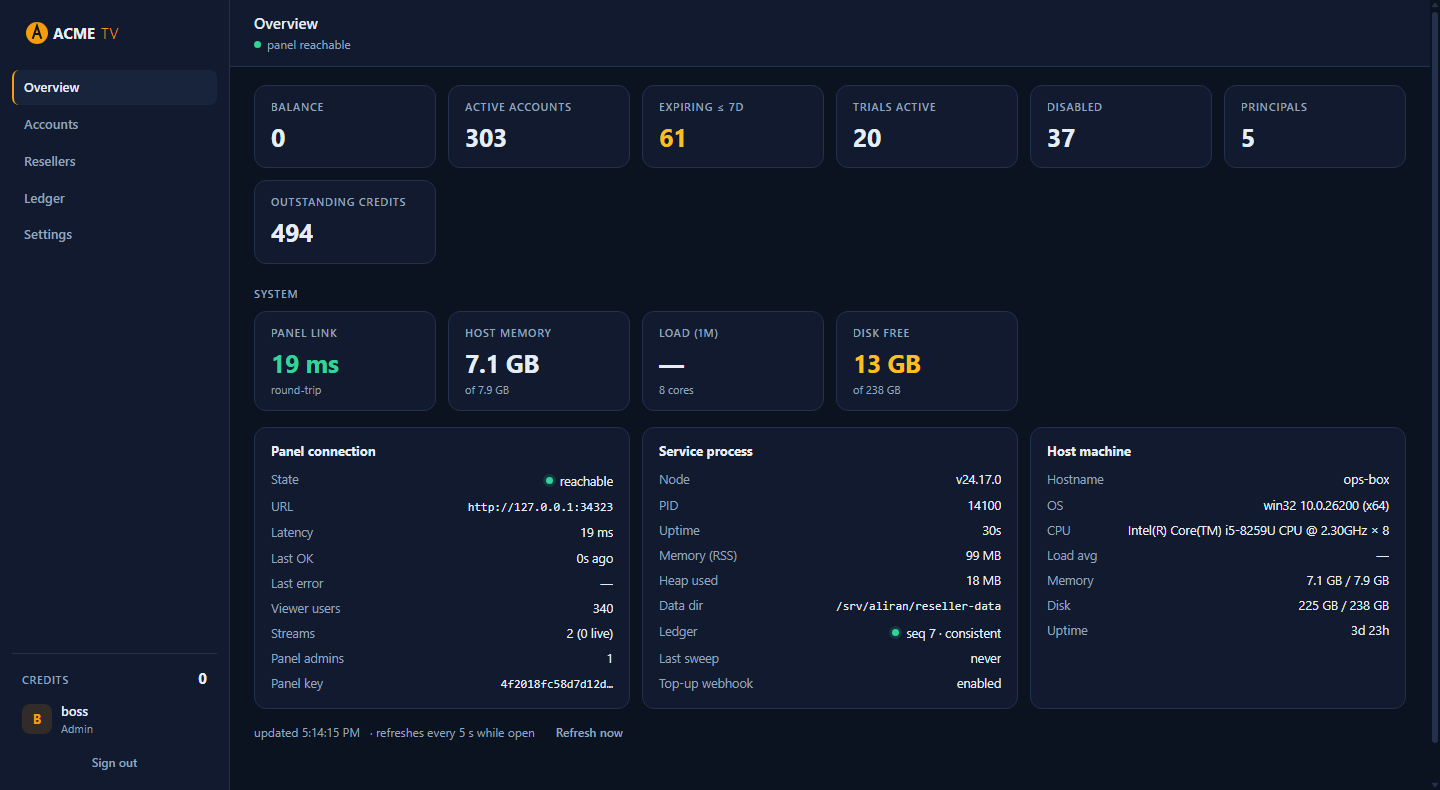
Variables
| Env var | What it does | Served at |
|---|---|---|
BRAND_NAME |
Brand text in the login card, the sidebar, and the browser-tab title. Without a logo, it renders like the stock brand: first word bold, the rest in the accent tone (for example, "Acme TV" becomes Acme TV). |
/branding.json |
BRAND_LOGO_FILE |
Path to a logo image. When set, it replaces the brand text in the sidebar and on the login card. The name still titles the tab and is the image's alt text. | /branding/logo |
BRAND_FAVICON_FILE |
Path to a favicon image for the browser tab. Without it, the tab shows a dot in the accent colour, which follows your theme override automatically. | /branding/favicon |
BRAND_LOGIN_BG_FILE |
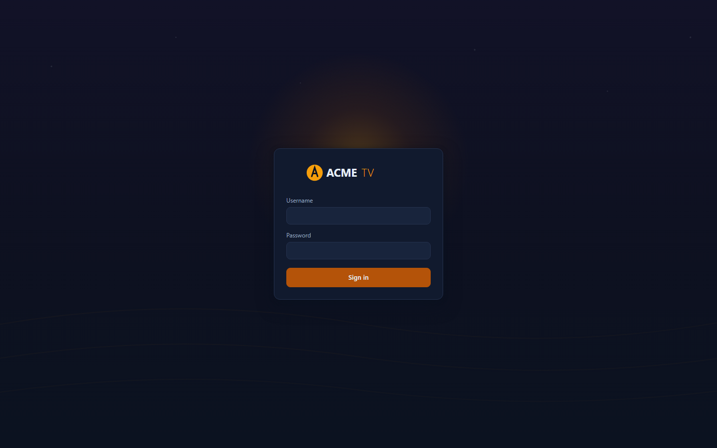
Path to a login-page backdrop image. It renders full-viewport (cover) behind the login card, with an automatic dark scrim so the card stays readable. This setting wins over BRAND_LOGIN_STYLE. |
/branding/login-bg |
BRAND_LOGIN_STYLE |
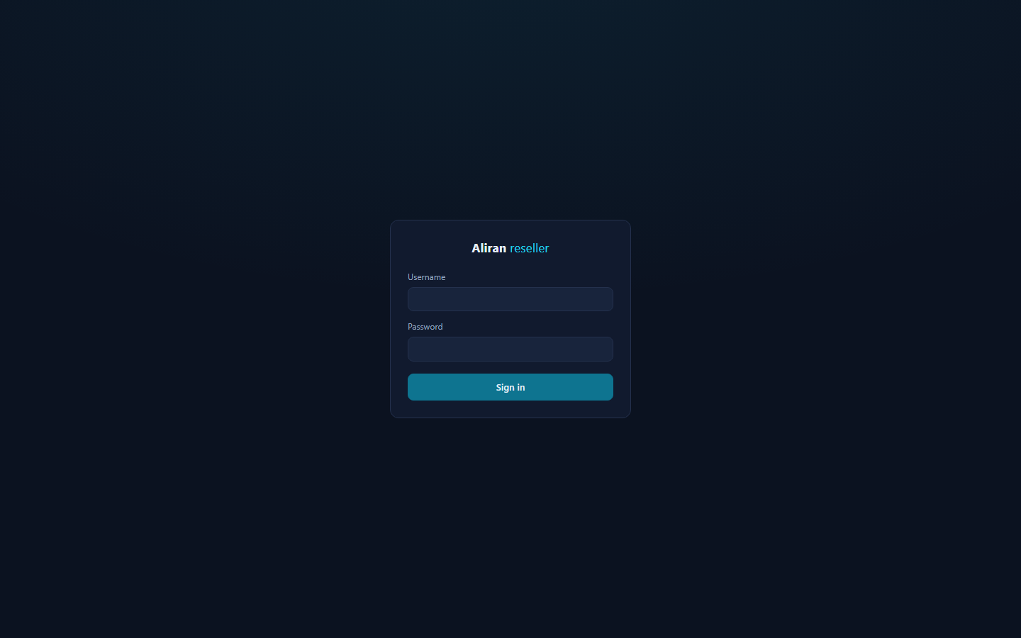
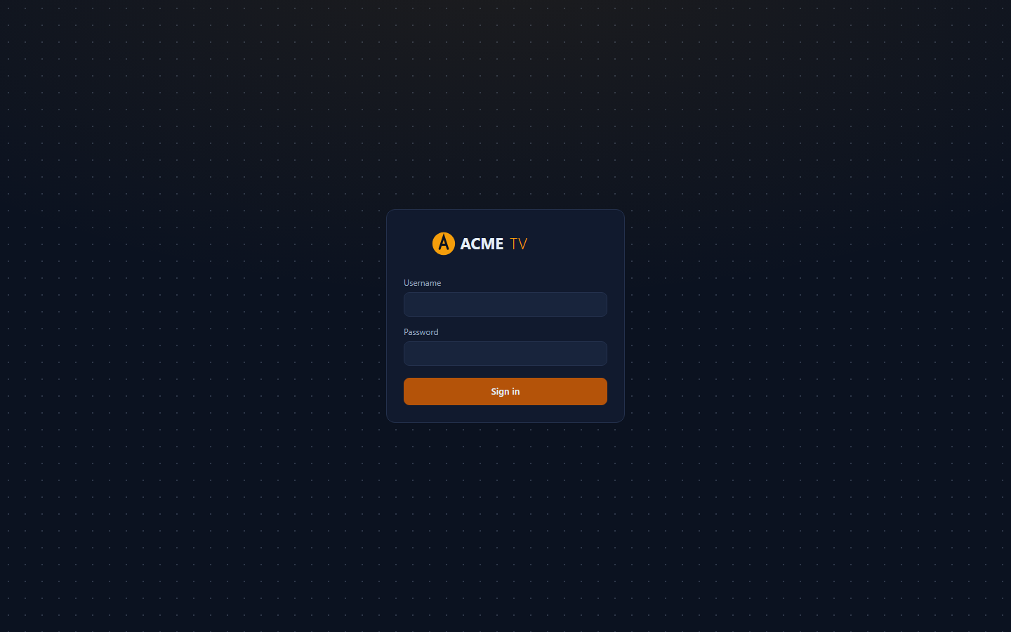
Built-in login backdrop pattern for when you have no artwork: glow (default — a soft accent radial), plain (flat background), grid, dots, or stripes. All patterns derive from the theme tokens, so they follow a colour rebrand automatically. Unknown values fall back to glow. |
/branding.json |
BRAND_THEME_FILE |
Path to a JSON file that overrides any of the 11 colour tokens (next section). | /branding.css |
All four are optional and independent. Set only what you need. A typical Docker deployment mounts one read-only brand directory:
services:
  reseller:
    volumes:
      - ./acme-brand:/brand:ro
    environment:
      BRAND_NAME: "Acme TV"
      BRAND_LOGO_FILE: /brand/logo.svg
      BRAND_FAVICON_FILE: /brand/favicon.png
      BRAND_THEME_FILE: /brand/theme.json
Images — formats and sizes
Accepted formats (by file extension): SVG, PNG, JPEG, WebP, ICO. The tool refuses any other extension. SVG is the recommendation for the logo, because it stays crisp at every zoom level. If you use a raster image instead, supply it at 2× the rendered size.
| Image | Rendered box (max) | Supply |
|---|---|---|
| Logo — sidebar | 30 px tall × 176 px wide | SVG, or PNG ≥ 60 px tall, with a transparent background (it sits on the panel colour). Wide wordmarks work best — the image scales down proportionally to fit the box. |
| Logo — login card | 44 px tall × 250 px wide | Same file — the login card just allows it larger. |
| Favicon | browser tab (16–32 px) | 32×32 PNG or ICO, or an SVG. |
| Login backdrop | full viewport, cover, centre-anchored |
1920×1080 or larger (or an SVG). An automatic background-tinted scrim dims it, so mid-tone photography works. Keep the centre third calm, since the card sits there, and keep the file lean — about ≤ 500 KB, since it loads on every login view. |
There is one logo slot. The same file is used everywhere it appears. Files
are read per request (cache-control: no-cache), so replacing the file on
disk rebrands on the next reload — no restart needed.
The login landing, three ways: stock (the glow pattern), an operator
backdrop image (auto-scrimmed, with the logo), and the built-in dots
pattern:
Colours — the 11 theme tokens
BRAND_THEME_FILE is a JSON object using any subset of the 11 token
names, in 6-digit hex only (#RRGGBB). The dashboard silently ignores
unknown keys and malformed values. An unreadable file simply means "no
overrides" — a typo can never take the dashboard down.
{
  "bg": "#0B1220",
  "panel": "#111A2E",
  "panel-2": "#18243C",
  "border": "#24314D",
  "text": "#E5EEF7",
  "muted": "#93A4BF",
  "accent": "#F59E0B",
  "accent-dim": "#B45309",
  "danger": "#F87171",
  "ok": "#34D399",
  "warn": "#FBBF24"
}
What each token paints. Every other colour in the UI is derived from
these via color-mix, so overriding a token carries all of its tints with
it:
| Token | Paints |
|---|---|
bg |
The page background. |
panel |
Sidebar, topbar, cards, table surface, dialogs, popover menus. |
panel-2 |
One step up: inputs, buttons, hovers, chips, segmented controls. |
border |
Card and input borders; table hairlines derive from it at 55%. |
text |
Primary text. |
muted |
Secondary text: labels, table headers, kv labels, hints, nav idle. |
accent |
The brand: accent word/logo tone, active nav bar, links, trial badge, avatar, sort arrows, focus tints, the default favicon dot. |
accent-dim |
Fills behind light text: primary buttons, focus outlines. |
danger |
Destructive: delete actions, error dots/badges/toasts, negative ledger deltas. |
ok |
Healthy: active dots, reachable state, positive ledger deltas. |
warn |
Attention: expiring accounts, threshold-crossing System tiles. |
Practical rules:
- Start with
accent+accent-dim. For most brands that is the whole job — the demo rebrand in the repo history changed exactly those two. - Keep
textvsbg/panelat ≥ 4.5:1 contrast (WCAG AA), andmutedlegible onpanel. - Leave
danger/ok/warnsemantic. Red/green/amber must keep meaning the same thing under every brand — this is the shared-theme contract. Adjust their shade, not their hue. - The dashboard is designed dark. A light theme is possible, since all 11 tokens are yours, but check row hover, dialogs, and the segmented control afterward — the derived tints assume a dark base.
How it works, and scope
The overrides are served as /branding.css, layered after the
stylesheet's built-in shared theme block. That block stays byte-identical
across the panel, broadcaster, and reseller dashboards (npm run
test:theme), so white-labelling never forks the source. This wires up
the theme seam for the reseller dashboard specifically. The panel and
broadcaster dashboards are operator-internal, and they keep the stock
brand. Rebrand them in source if you must — the same 11 tokens, the same
block — but edit all three sheets, or none.
To read as one product with your client apps, align the five core
tokens with your brand descriptor's branding.colors (see the top of
this page): bg ↔ background, panel ↔ surface, text ↔ text,
muted ↔ textDim, accent ↔ accent. This is the same correspondence
the repo's theme test enforces between the stock dashboard and the stock
app.
Movies & Series — the external VOD provider
Both apps can show a Movies & Series section fed by a third-party VOD provider the operator already has accounts with. Here are the design facts a brand needs:
- The panel owns the switch. The section exists only while the
operator has the provider enabled. The "VOD provider" card on the
panel dashboard's Sources tab holds the enable bit and the coordinates —
you can also set it with
PATCH /api/vod-config, thevod-config-setCLI verb, or the MCP tools. Nothing about the provider lives in the brand descriptor. A viewer picks up a config change at their next login or app start, so flipping it on needs no client rebuild. - Credential pass-off. The app authenticates to the provider with the
viewer's own app account: the username as
username, and the app password astoken. The operator provisions matching accounts on both sides. The panel stores no provider credential. Be aware of the consequence: the provider's playable URLs embed that token as a query parameter, over https, so the viewer's app password reaches the provider's media servers. Treat provider accounts accordingly. - HTTPS-only, enforced client-side. The app refuses a cleartext
apiBasebefore dialing, and it never substitutes the token into a non-https playable URL. - Brand kill-switch. A brand that never wants the section can set
sections.vod: falsein its descriptor. Then the tile never renders, even with the panel switch on. - Never ship dev credentials. The gitignored
vod.devoverride inconfig/service.jsonis for local testing only. See Client build.
Movies and Series — per-kind sources
The provider config carries one source name per catalog kind:
sources.movies and sources.series. With only a movies source set, the
apps show movies and keep Series honestly empty. Setting a series source —
with vod-config-set --series-source <name>, the sources map on
PATCH /api/vod-config, or the dashboard card's field — lights up series
browsing: a grid, a detail page with seasons and episode lists, and
episode playback. This happens at the viewer's next login, again with no
client rebuild. One provider download feeds both kinds plus the genre
names, so enabling series adds no extra provider traffic.
What the section looks like
Both apps render the same browse structure. The strings are in English and are not themeable beyond the normal color tokens. The layout is: a left menu (Movies / Series / Search — search is its own view), a tab bar (Recommended · My List · Genres · All), and a sort menu (Recently added · A-Z · Newest releases · Oldest releases · Recently watched) behind an always-visible "Sort by" chip. The alphabetical sort adds a vertical A–Z jump rail. Genre cards come from the provider's own category names. Recommended shows one-row "Recently added" and "Newest releases" rails. Titles resume where the viewer left off, and the VOD players offer the same audio/subtitle track selection as live playback.
My List and watch history stay on the device
The watchlist ("My List") and the watch history that powers Recently watched and resume are stored only in the app's local preferences file on the viewer's device. They are never sent to the panel, the provider, or anywhere else. The operator cannot see them, and neither can you. Uninstalling the app, or clearing its data, erases them. If you write your own privacy copy, you can state this plainly.
Keys and credentials
panelPubKeyis public. It ships inside every APK, like the branding. Set your panel's key in the brand descriptor for real builds.- Credentials are not brand data.
brand.mjsrejects a descriptor carrying adevlogin block. For a local demo build against your own panel,--devmerges the missing deploy-time values — including the dev auto-login — from your gitignoredclient/config/service.jsonat build time. Nothing lands in the brand dir.
Shipping to production
- Signing. Like the stock client, branded release builds sign with
the public RN debug keystore — fine for demos, not shippable.
Generate a per-brand keystore and wire it into
client/android/app/build.gradle(signingConfigs) before distributing anything (see the React Native signed-APK guide). - Versioning.
versionCode/versionNameare shared app defaults today. Bump them inclient/android/app/build.gradleper release train. - One generic APK instead. If you prefer a single unbranded binary, the public keyless flavor takes the descriptor at runtime: first run shows a Connect screen where the viewer enters your panel key and account. See Client build. Brand packaging exists for the opposite goal: a store listing that is the operator's product.